Raygun partnered with Kidango on a full rebrand and website redesign to help the nonprofit better tell their story, clarify their impact, and connect with more families and donors. Our goal was to create a flexible design system driven by their joyful and nurturing approach to care that would feel appropriate in multiple contexts — from their care centers to statehouses.
Ensuring every child is on a path to thrive
Kidango is building a future where all children have what they need to succeed in kindergarten and in life. They work to make this vision a reality through their network of care centers, comprehensive family services, and policy advocacy at the local and state levels in California.

Raygun x Kidango


Collaborating with illustrator Channin Fulton, we incorporated custom hand drawn illustrations into the brand to evoke a sense of play and curiosity. Each illustration was designed to reflect elements of Kidango’s work while joyfully representing a child’s experience in a Kidango classroom.


One of our favorite parts of the rebrand is the new photography. Raygun provided art direction for the photoshoots to capture bright, crisp photos that can be used across all marketing, fundraising, and advocacy channels. As parents ourselves, we wanted to tell a more cohesive story about what it’s like to experience education at Kidango. We also wanted to visually capture what it’s like to work inside a Kidango classroom to aid the nonprofit’s recruiters when communicating with potential employees. The mix of candid and posed shots of children, families, and staff create an approachable, genuine look for Kidango’s marketing materials and website.


The website supports a robust publishing platform that allows their team to easily publish pages, reports, and documents relevant to their key audience groups. The searchable map feature allows families to quickly find and enroll in the nearest care centers.
Explore more case studies

Education changes lives
Branding, illustration, and website design for Tailored for Education
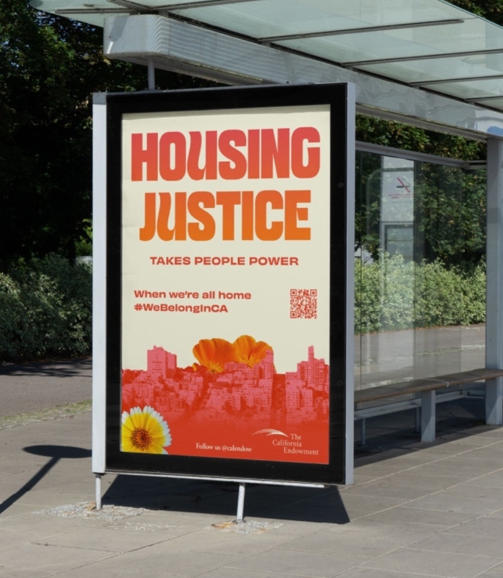
When we’re all home
Campaign strategy and design for The California Endowment